| Module | What we added | Model |
|---|---|---|
| 1 | Decomposition + benchmark | STL + Drift + SNAIVE |
| 2 | Smarter trend-cycle | STL + ETS / ARIMA |
| 3.1–2 | External context | TSLM, dynamic regression |
| 3.3 | Harmonic regression | ARIMA + Fourier terms |
| 3.4 | Automated & interpretable | Prophet |
Look at how far our model has come since Module 1:
| Module | What we added | Model |
|---|---|---|
| 1 | Decomposition + benchmark | STL + Drift + SNAIVE |
| 2 | Smarter trend-cycle | STL + ETS / ARIMA |
| 3.1–2 | External context | TSLM, dynamic regression |
| 3.3 | Harmonic regression | ARIMA + Fourier terms |
| 3.4 | Automated & interpretable | Prophet |
Every previous model required us to make choices manually: how many AR terms? Which regressors? Where do the knots go?
The knot problem we left open
In Linear Regression, we saw that piecewise TSLM is sensitive to where we place the knots — different choices produce dramatically different forecasts, even with similar in-sample fit. Prophet solves this automatically.
Prophet is a forecasting procedure developed by Meta (Facebook) and released as open source in 2017. It was designed for business time series — daily, weekly, and yearly data with strong seasonal effects, holidays, and shifting trends.
“Prophet is a procedure for forecasting time series data based on an additive model where non-linear trends are fit with yearly, weekly, and daily seasonality, plus holiday effects. It works best with time series that have strong seasonal effects and several seasons of historical data.”
At its core, Prophet fits a decomposition model:
y(t) = g(t) + s(t) + h(t) + \varepsilon_t
Sound familiar?
This is exactly what we’ve been building all semester — trend + seasonality + external effects. Prophet just automates the specification and fits it in a Bayesian framework using Stan.
The key innovation over piecewise TSLM is automatic changepoint detection. Prophet:
changepoint_range proportion of the data (default: 80%).n_changepoints (default 25) and changepoint_prior_scale (flexibility of trend changes).No more guessing where the knots go.
| Situation | Use Prophet? |
|---|---|
| Sub-daily data (hourly, daily) with multiple seasonal cycles | ✅ |
| Business data with holidays and known events | ✅ |
| Need interpretable components for stakeholders | ✅ |
| Several seasons of history available | ✅ |
| Short series (< 2 full seasonal cycles) | ❌ |
| Series with no clear trend or seasonality | ❌ |
| Need formal inference on model parameters | ❌ |
| Need prediction intervals from theory, not simulation | ⚠️ |
:::
Prophet is not always better than ARIMA
Prophet was designed for at-scale, analyst-friendly forecasting. On many classical monthly or quarterly economic series, a well-specified ARIMA or ETS will outperform it. Always compare on a held-out test set.
fable.prophetProphet is available in R through two packages:
prophet — the original package. Works standalone, does not integrate with fable.fable.prophet — a fable-compatible wrapper by Mitchell O’Hara-Wild. Lets us use Prophet inside model(), forecast(), accuracy(), and all the tools we already know.Dependency: Stan
fable.prophet depends on rstan and prophet. On first install, R will also install Stan and its dependencies. This can take a few minutes — plan accordingly before class.
Inside model(), Prophet is specified with the prophet() function. Like ARIMA() and ETS(), it can be fully automatic or manually specified.
The growth() term specifies the trend model:
growth("linear") — piecewise linear trend. Best for series that grow or decline without a natural ceiling.growth("logistic") — logistic growth (S-curve). Requires a capacity column in the data specifying the theoretical maximum.The season() term adds a Fourier-approximated seasonal pattern:
order = Fourier K
The order argument in season() is the same K we used in harmonic regression (fourier(K = ...)). Higher K → more flexible seasonal shape, but more parameters. Start with the default and adjust if residuals show seasonal structure.
We’ll apply Prophet to monthly passenger counts at Los Angeles International Airport (LAX), broken down by domestic and international flights — a dataset with a clear piecewise trend, multiplicative seasonality, and a major structural break (the 2001 and 2008 shocks).
lax_passengers <- read.csv(
"https://raw.githubusercontent.com/mitchelloharawild/fable.prophet/master/data-raw/lax_passengers.csv"
)
lax_passengers <- lax_passengers |>
mutate(datetime = lubridate::mdy_hms(ReportPeriod)) |>
group_by(
month = yearmonth(datetime),
type = Domestic_International
) |>
summarise(passengers = sum(Passenger_Count), .groups = "drop") |>
as_tsibble(index = month, key = type)
lax_passengerstsibble — type (Domestic / International) is the key variable.
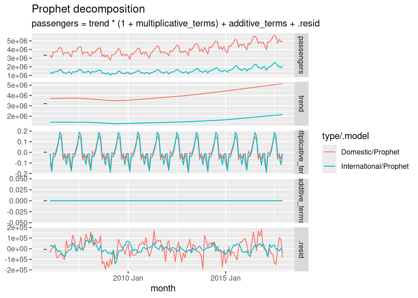
One of Prophet’s biggest advantages in practice: interpretable components that you can show to a non-technical audience.
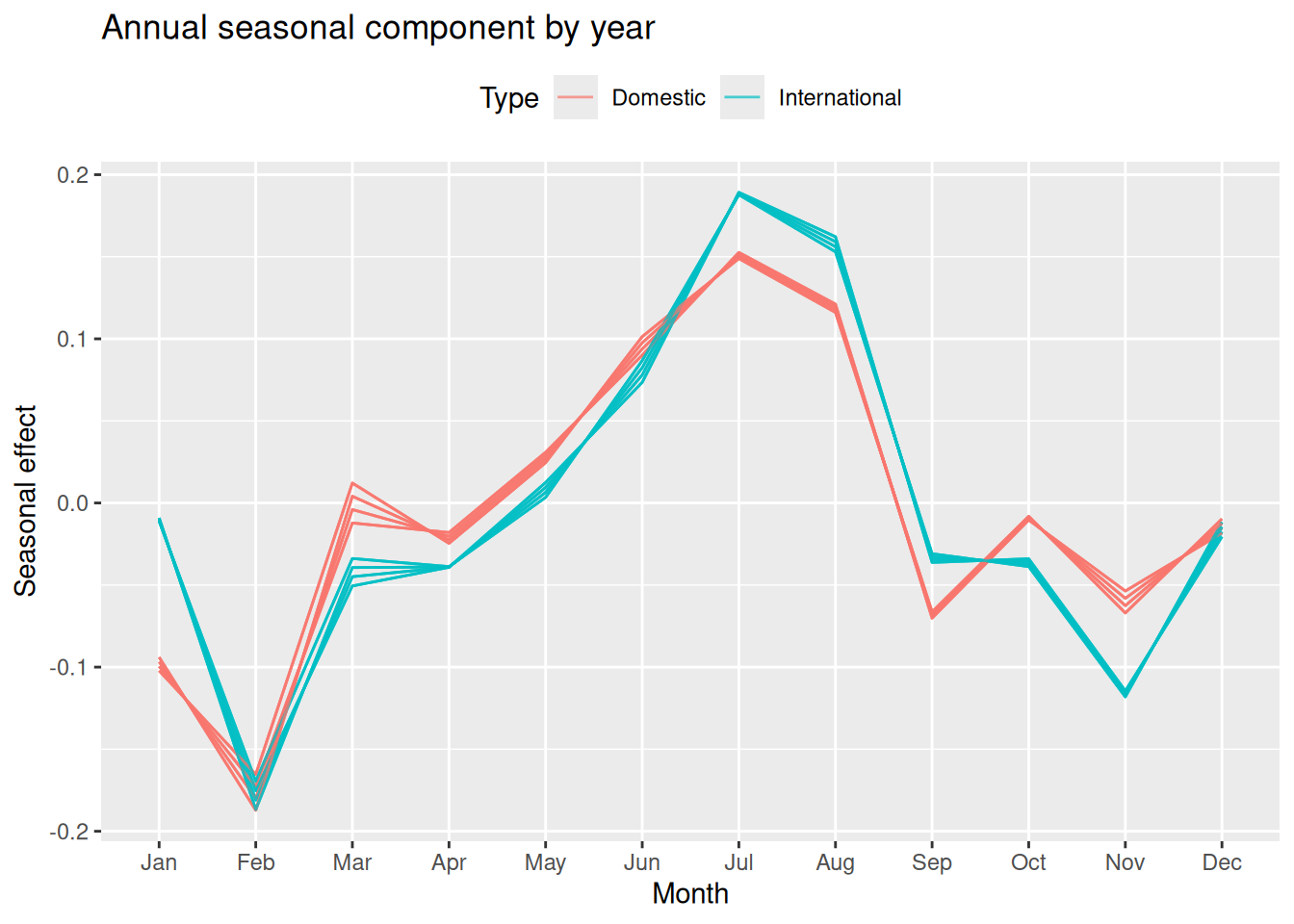
We can also visualize the seasonal component overlaid by year — useful to check if the seasonal shape is stable over time:
lax_fit |>
select(type, Prophet) |>
components() |>
ggplot(aes(
x = lubridate::month(month, label = TRUE),
y = year,
colour = type,
group = interaction(type, lubridate::year(month))
)) +
geom_line(alpha = 0.7) +
labs(
title = "Annual seasonal component by year",
x = "Month",
y = "Seasonal effect",
color = "Type"
) +
theme(legend.position = "top")year is the name of the annual seasonal component extracted by components().
What to look for
If the seasonal lines are stacked consistently, the shape is stable across years — a multiplicative model is appropriate. If lines diverge or change shape dramatically, you may need to reconsider the specification.
lax_fc <- lax_fit |>
forecast(h = "2 years")
lax_fc |>
autoplot(
lax_passengers |> filter_index("2012 Jan." ~ .),
level = 80
) +
facet_wrap(~ type, ncol = 1, scales = "free_y") +
labs(
title = "LAX passenger forecasts — 2018–2019",
y = "Passengers",
x = NULL,
color = "Model"
) +
theme(legend.position = "top")Warning: The future dataset is incomplete, incomplete out-of-sample data will be treated as missing.
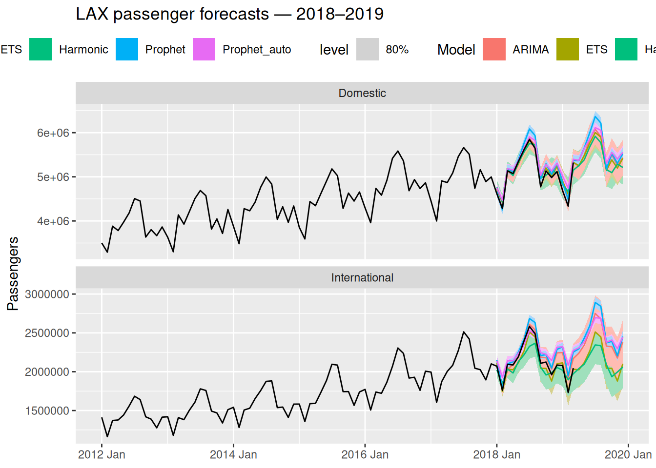
9 observations are missing between 2019 Apr and 2019 Dec
Check accuracy by key
When your tsibble has a key variable (like type here), accuracy() returns one row per model per key. A model that performs best for Domestic passengers may not be best for International — always check both.
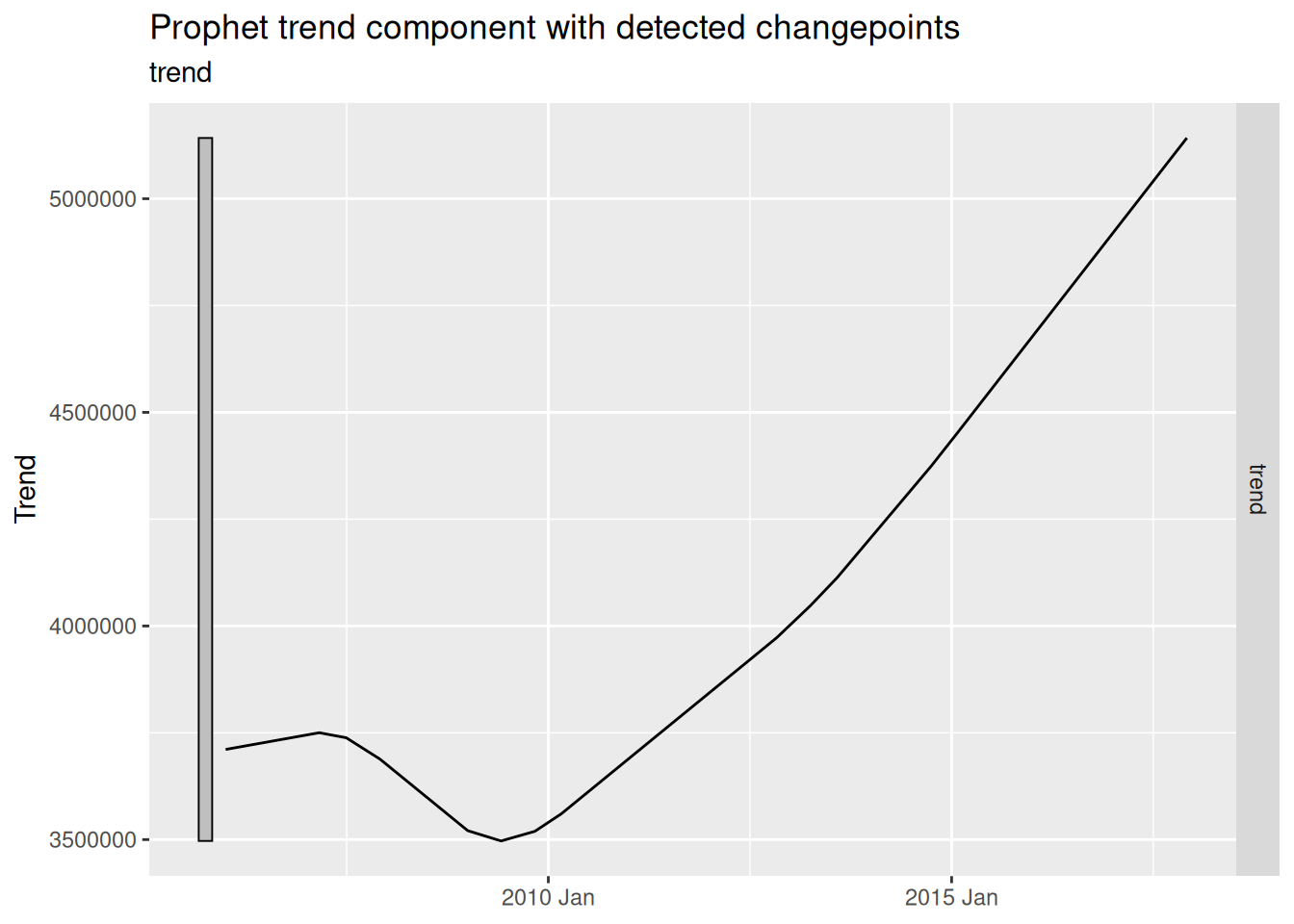
We can extract the changepoints Prophet detected and plot them against the original series — a powerful diagnostic for communicating with stakeholders.
Let’s put all models side by side — zooming in on the test period:
p <- lax_fc |>
ggplot(aes(x = month, y = .mean, color = .model)) +
geom_line() +
geom_line(
data = lax_passengers |> filter_index("2015 Jan." ~ .),
aes(y = passengers, color = NULL),
color = "grey30",
linewidth = 0.8
) +
facet_wrap(~ type, ncol = 1, scales = "free_y") +
labs(
title = "All models: point forecast comparison",
y = "Passengers",
x = NULL,
color = "Model"
) +
theme(legend.position = "top")
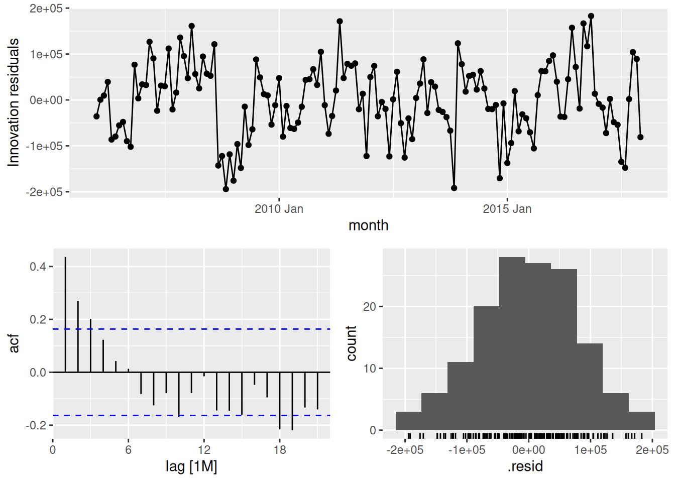
ggplotly(p)Key takeaways:
fable, Prophet fits into the same model() → forecast() → accuracy() workflow — no new syntax to learn.Coming up in Module 4: We’ve now seen all the main model families. In Module 4, we tackle what happens when data has multiple seasonal periods simultaneously (daily + weekly + yearly), and how to make our models robust to outliers, missing values, and real-world messiness — including ensembling the models we’ve built throughout the semester.
Talk by the Prophet team at PyData — covers the motivation, the math, and practical use cases (30 min).

Time Series Forecasting