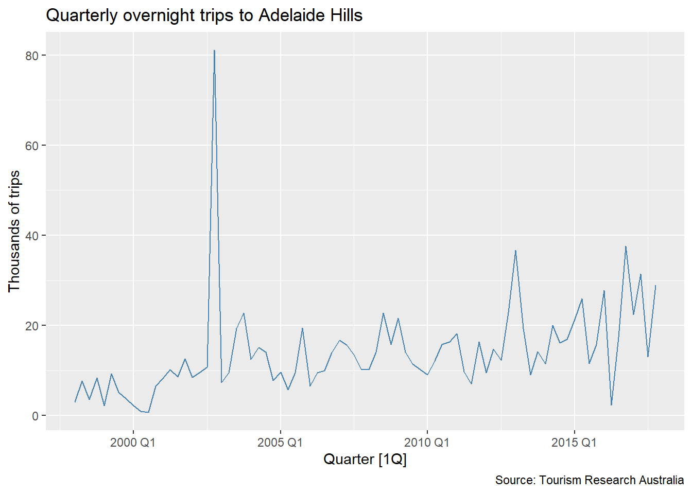
What do you observe in this series? Think about trend, seasonality, variance — and anything else that catches your eye.
In time series, removing an outlier and leaving a gap is not a solution — it creates a missing value problem that must also be addressed.
In cross-sectional data, outlier detection often works directly on the raw values:
\text{outlier if } y < Q_1 - 1.5 \cdot \text{IQR} \quad \text{or} \quad y > Q_3 + 1.5 \cdot \text{IQR}
The fix: decompose first, then inspect the remainder
By removing the trend before applying the IQR rule, we isolate the variation that cannot be explained by the regular structure of the series. Only then does outlier detection make sense.
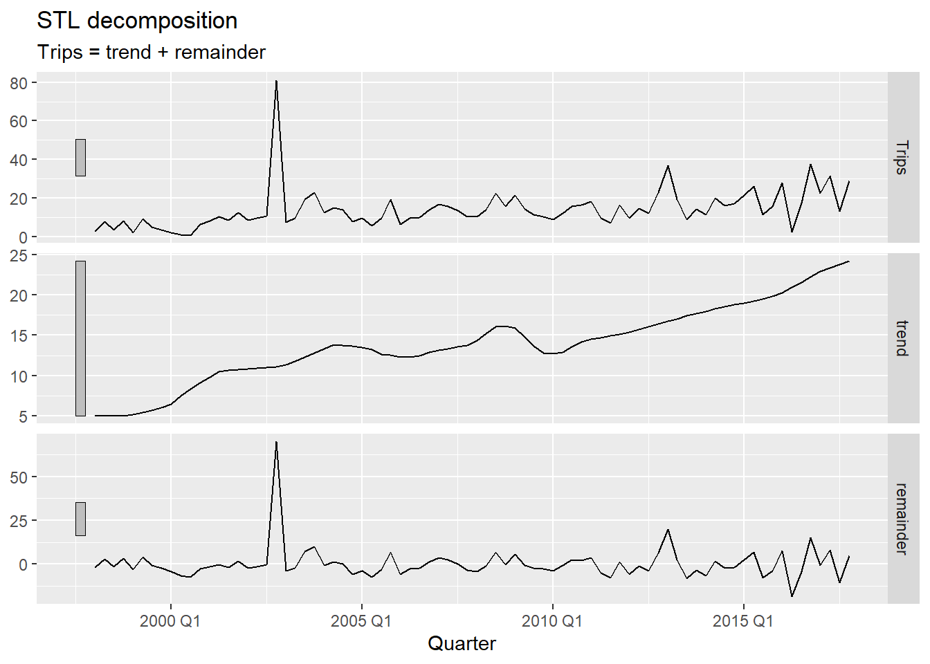
We decompose the series with STL using season(period = 1) to remove only the trend — keeping seasonality in the remainder so it is not mistaken for an anomaly1. We then apply the IQR rule to the remainder:
\text{outlier if } R_t < Q_1 - c \cdot \text{IQR} \quad \text{or} \quad R_t > Q_3 + c \cdot \text{IQR}
where c = 1.5 is the standard threshold and c = 3 flags only more extreme observations.
season(period = 1) fits a non-seasonal STL — only the trend is extracted. This ensures the remainder reflects true anomalies and seasonal variation together, rather than having a genuine outlier absorbed into the seasonal component.
c_threshold to 3 makes detection stricter — only more extreme remainders are flagged. Start with 1.5 and increase if too many periods are flagged.
Choosing the threshold: 1.5 vs. 3
The value c = 1.5 is the standard Tukey fence used in boxplots — it flags observations that are moderately unusual. A value of c = 3 (the “far fence”) is more conservative and only captures truly extreme values. In practice, start with 1.5, inspect the flagged periods, and tighten the threshold if normal variation is being flagged.
anti_join() removes the flagged periods from the original data.
fill_gaps() makes the missing periods explicit — they now appear as NA rows in the tsibble rather than simply not existing.
We removed the outlier — but now there is a gap. The model still needs a value for that period.
We have gaps. What do we do with them?
Some approaches that might seem right at first — but do not hold up under scrutiny:
All of these are simplified versions of models we have already studied. Can we do something more principled — something that uses the full structure of the series, including trend, seasonality, and autocorrelation?
A natural next suggestion: fit an ETS model to the available data and use it to fill the gaps.
The problem: ETS cannot be estimated when the series contains NA values.
ETS is built on weighted averages of all past observations:
\hat{y}_{t} = \alpha y_{t-1} + \alpha(1-\alpha) y_{t-2} + \alpha(1-\alpha)^2 y_{t-3} + \cdots
If any y_t is NA, every weighted sum that includes it becomes NA — and the entire estimation collapses.
mean() with a missing value returns NA — the average is undefined when one element is unknown.
NA propagates the missingness. ETS, as a chain of weighted sums over all observations, fails entirely if any single observation is missing.
[1] NA
[1] NA
ARIMA models can handle missing values. They use a state-space representation where the likelihood is computed period by period — missing observations are skipped in the likelihood update, and the state is propagated forward without an observation.
The workflow:
NA valuesinterpolate() to replace each NA with the model’s conditional expectation for that periodNA periods do not contribute to parameter estimation but are accounted for in the state propagation.
interpolate() replaces each NA with the in-sample conditional expectation — the most likely value for that period given the surrounding data and the estimated model.
autolayer tries to draw a line segment over only 2–3 isolated points.geom_point() with a diamond shape (shape = 18) marks each imputed period clearly and reliably, regardless of how many periods were flagged.geom_label() shows the imputed value directly on the plot.Impact on forecasts
A model trained on data that includes the anomalous observation will produce different — and usually worse — forecasts than one trained on the cleaned series. The outlier inflates variance estimates and can distort trend and seasonal parameter estimates, leading to wider and less accurate prediction intervals.
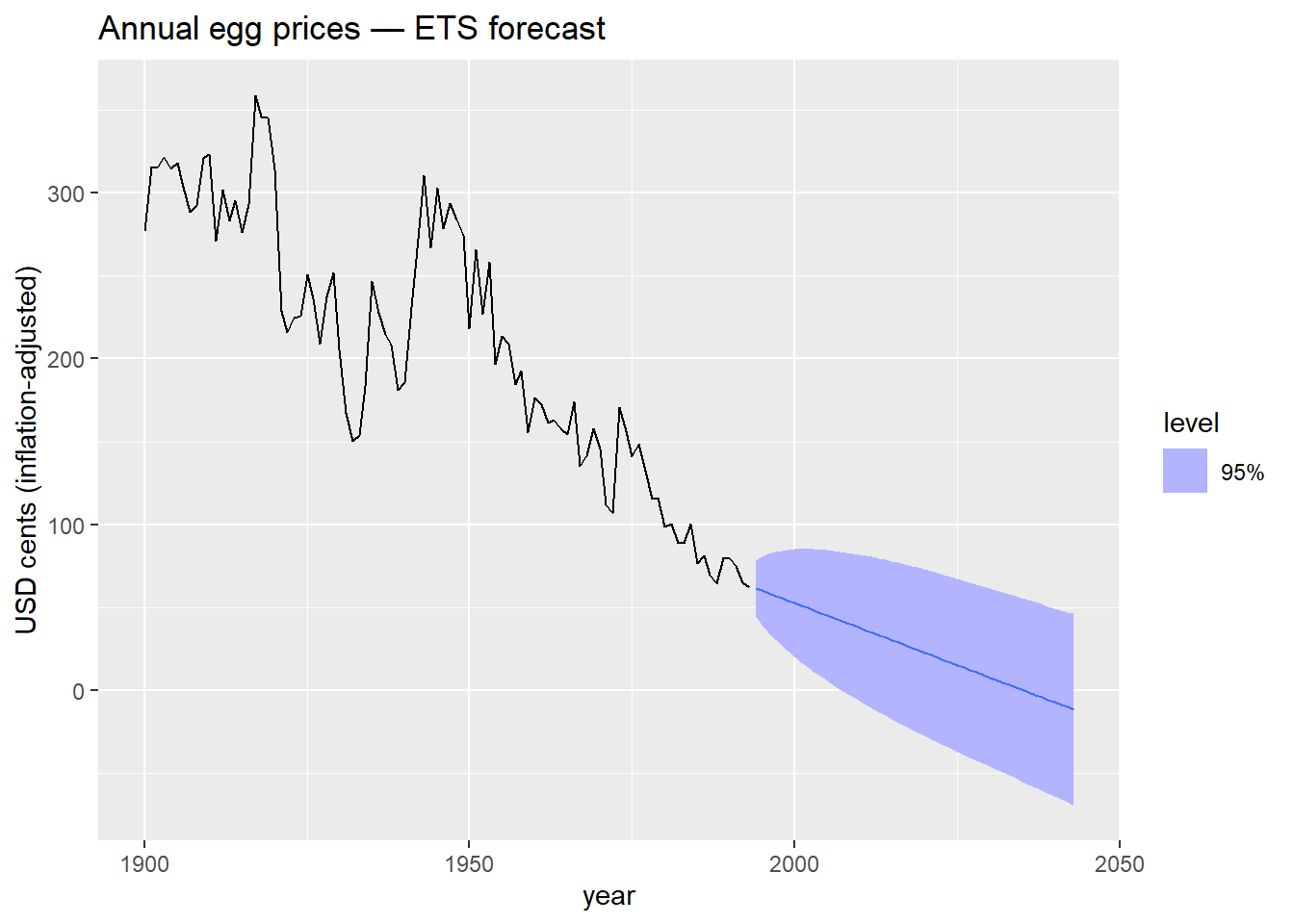
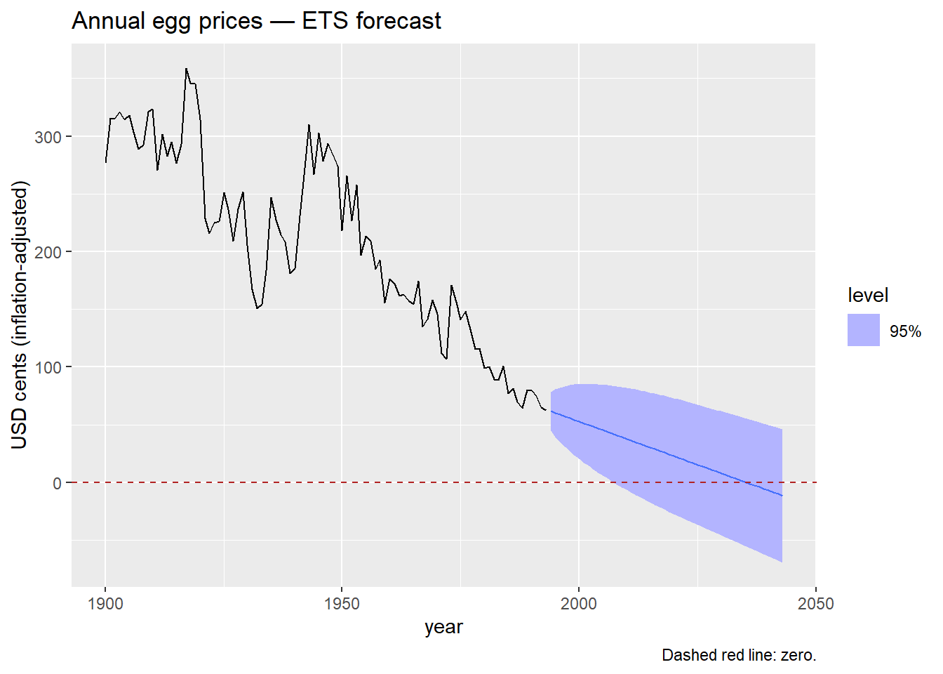
What do you observe? Does anything look strange about those prediction intervals?
What mathematical transformation do you know that forces all output values to be strictly positive?
eggs in log(). fable handles the back-transformation automatically — forecasts and prediction intervals are returned on the original scale.
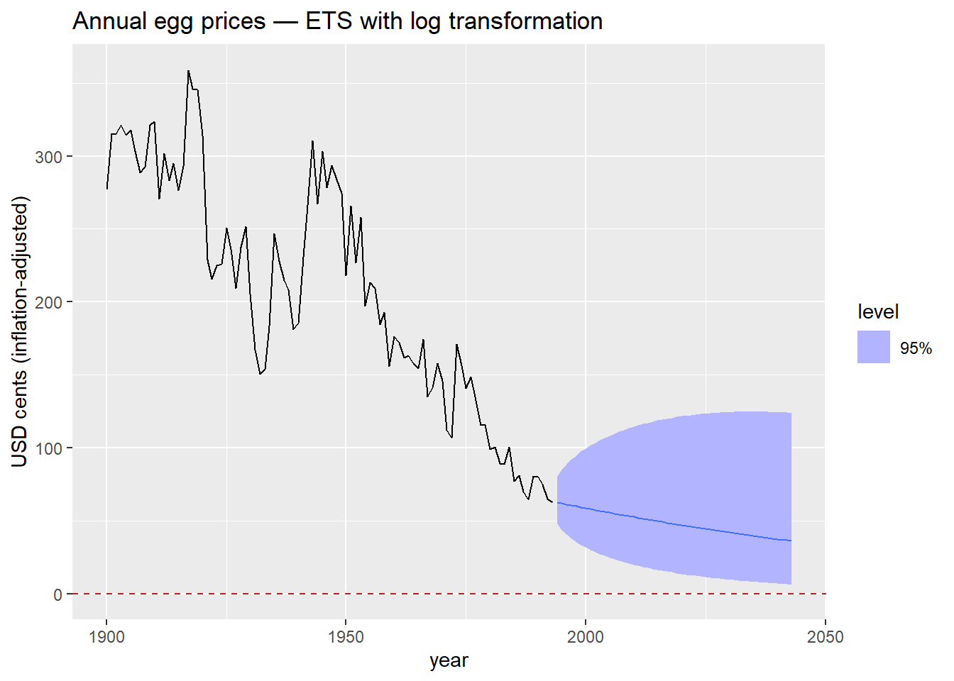
The log transformation is the simplest way to keep forecasts positive. It works well when the series is strictly positive and the variance grows with the level — both common features of price and volume data.
The log transformation handles a lower bound of zero. But what if we need to constrain forecasts between two finite values [a, b]?
Real-world examples
Proportions and rates:
Physical systems:
Financial and regulatory:
The scaled logit maps any value in (a, b) to the entire real line (-\infty, +\infty):
f(x) = \log\left(\frac{x - a}{b - x}\right)
The inverse — used to back-transform forecasts to the original scale — is:
f^{-1}(y) = \frac{(b - a)\, e^y}{1 + e^y} + a
This guarantees that back-transformed forecasts always lie strictly within (a, b).
Connection to the logistic function
The standard logistic (sigmoid) function maps \mathbb{R} \to (0, 1):
\sigma(y) = \frac{e^y}{1 + e^y}
The scaled logit is a linear rescaling of this to the interval (a, b). The same structure appears in logistic regression, neural network activation functions, and ecological population models with a carrying capacity.
fable when back-transforming forecasts and prediction intervals.
new_transformation() bundles both functions into a single transformation object that fable recognizes.
egg_prices |>
model(
ETS(my_scaled_logit(eggs, lower = 50, upper = 400) ~ trend("A"))
) |>
forecast(h = 50) |>
autoplot(egg_prices, level = 95) +
geom_hline(yintercept = 50, color = "firebrick", linetype = "dashed") +
geom_hline(yintercept = 400, color = "firebrick", linetype = "dashed") +
labs(
title = "Annual egg prices — ETS within bounds [50, 400]",
y = "USD cents (inflation-adjusted)",
caption = "Dashed red lines: lower bound (50) and upper bound (400)."
)lower = 50 and upper = 400 reflect a plausible range for egg prices in this dataset. In practice, bounds should be informed by domain knowledge or regulatory constraints — not chosen to make the plot look neat.
The scaled logit requires that all historical observations fall strictly within (a, b). If any observation equals or exceeds the bounds, the transformation is undefined. Always verify your data range before applying it.
Key principle
These are not just data-cleaning steps. They are modeling decisions that affect forecast distributions, prediction intervals, and the interpretability of results. Make them deliberately and document your reasoning.
If you suspect outliers are hiding inside the seasonal pattern, you can use a full seasonal decomposition instead.

Time Series Forecasting