Code
library(tidyverse)
library(fpp3)
library(fable.prophet)library(tidyverse)
library(fpp3)
library(fable.prophet)In this review you will work with the aus_accommodation dataset, which contains quarterly data on Australian tourist accommodation — takings (in millions of AUD), room occupancy rates, and the Consumer Price Index (CPI) — for all Australian states and territories from 1998 Q1 to 2016 Q2.
Your target series is quarterly takings in New South Wales (NSW), the largest and most volatile accommodation market in Australia. CPI will serve as your exogenous predictor throughout the module.
The review follows the progressive arc of the course:
| Part | Topic |
|---|---|
| a | Exploratory analysis and data preparation |
| b | Module 1–2 baseline |
| c | TSLM with trend, seasonality, and CPI |
| d | Dynamic regression: ARIMA with CPI |
| e | Harmonic regression: Fourier terms + CPI |
| f | Prophet |
| g | Full model comparison and conclusions |
Make sure fable.prophet is installed:
install.packages("fable.prophet")Then load it alongside fpp3 at the top of your script.
a.1 Filter aus_accommodation to New South Wales only and store the result as nsw. Then plot Takings over time. Describe the patterns you observe: is there a trend? Is seasonality present? Does it appear additive or multiplicative?
a.2 Inspect the series for potential outliers using the STL remainder approach covered in class. Flag any anomalous quarters and decide whether they require treatment or whether the robust STL setting is sufficient.
a.3 Apply a Guerrero transformation to determine the optimal Box-Cox parameter \lambda. Based on the value you obtain and the plot from a.1, would you prefer a log transformation or the Guerrero \lambda? Justify your choice. Use this decision consistently throughout all remaining parts.
a.4 Create a train/test split: use data up to and including 2014 Q4 as the training set and 2015 Q1 onward as the test set. How many quarters are in the test set?
a.5 Plot CPI against time on the same panel as Takings (you may need to rescale). Does CPI appear to move together with Takings? Is this relationship likely to be causal, associative, or spurious? Briefly justify.
a.1 — Filter and plot
nsw <- aus_accommodation |>
1  filter(State == "New South Wales")

nsw |>
  autoplot(Takings) +
  labs(
    title = "Quarterly tourist accommodation takings — New South Wales",
    y     = "Millions of AUD",
    x     = NULL
)filter() on the State key isolates NSW. No index manipulation needed — the tsibble structure is preserved.
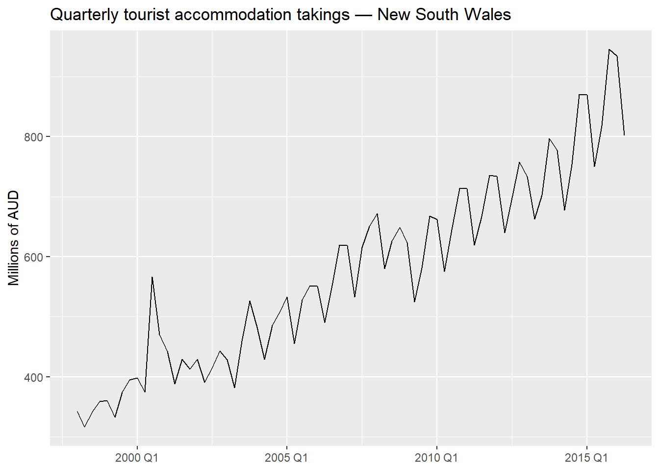
The series shows a clear upward trend and strong quarterly seasonality. The seasonal swings widen as the level rises, which is a hallmark of multiplicative (or log-additive) seasonality. A log or Box-Cox transformation is appropriate.
a.2 — Outlier detection
nsw_dcmp <- nsw |>
  model(STL(log(Takings) ~ trend(window = 11) + season(window = "periodic"),
            robust = TRUE)) |>
  components()

c_threshold <- 1.5

nsw_outliers <- nsw_dcmp |>
1  filter(abs(remainder) > c_threshold * IQR(remainder))

nsw_outliers |> select(Date, `log(Takings)`, remainder)If the flagged quarters are few and the robust = TRUE setting in STL already downweights them, no explicit removal is necessary. We proceed with the robust STL. If treatment were needed, we would replace the flagged values with NA and impute using na.kalman() or an STL-fitted value.
a.3 — Transformation
lambda <- nsw |>
  features(Takings, features = guerrero) |>
  pull(lambda_guerrero)

lambda
[1] 0.09607256The Guerrero \lambda will be close to 0, consistent with the multiplicative pattern observed in a.1. A log transformation (\lambda = 0) is the natural, interpretable choice: it stabilises the seasonal variance and yields percentage-change interpretable coefficients in regression. We use log(Takings) throughout.
a.4 — Train/test split
nsw_train <- nsw |> filter_index(. ~ "2014 Q4")
nsw_test  <- nsw |> filter_index("2015 Q1" ~ .)

nrow(nsw_test)   # Should be 6 quarters
[1] 6The test set covers 2015 Q1 – 2016 Q2: 6 quarters of out-of-sample evaluation.
a.5 — CPI vs. Takings
nsw |>
  pivot_longer(c(Takings, CPI), names_to = "variable", values_to = "value") |>
  ggplot(aes(x = Date, y = value)) +
  geom_line(colour = "steelblue") +
  facet_wrap(~ variable, scales = "free_y", ncol = 1) +
  labs(title = "Takings and CPI — New South Wales", x = NULL)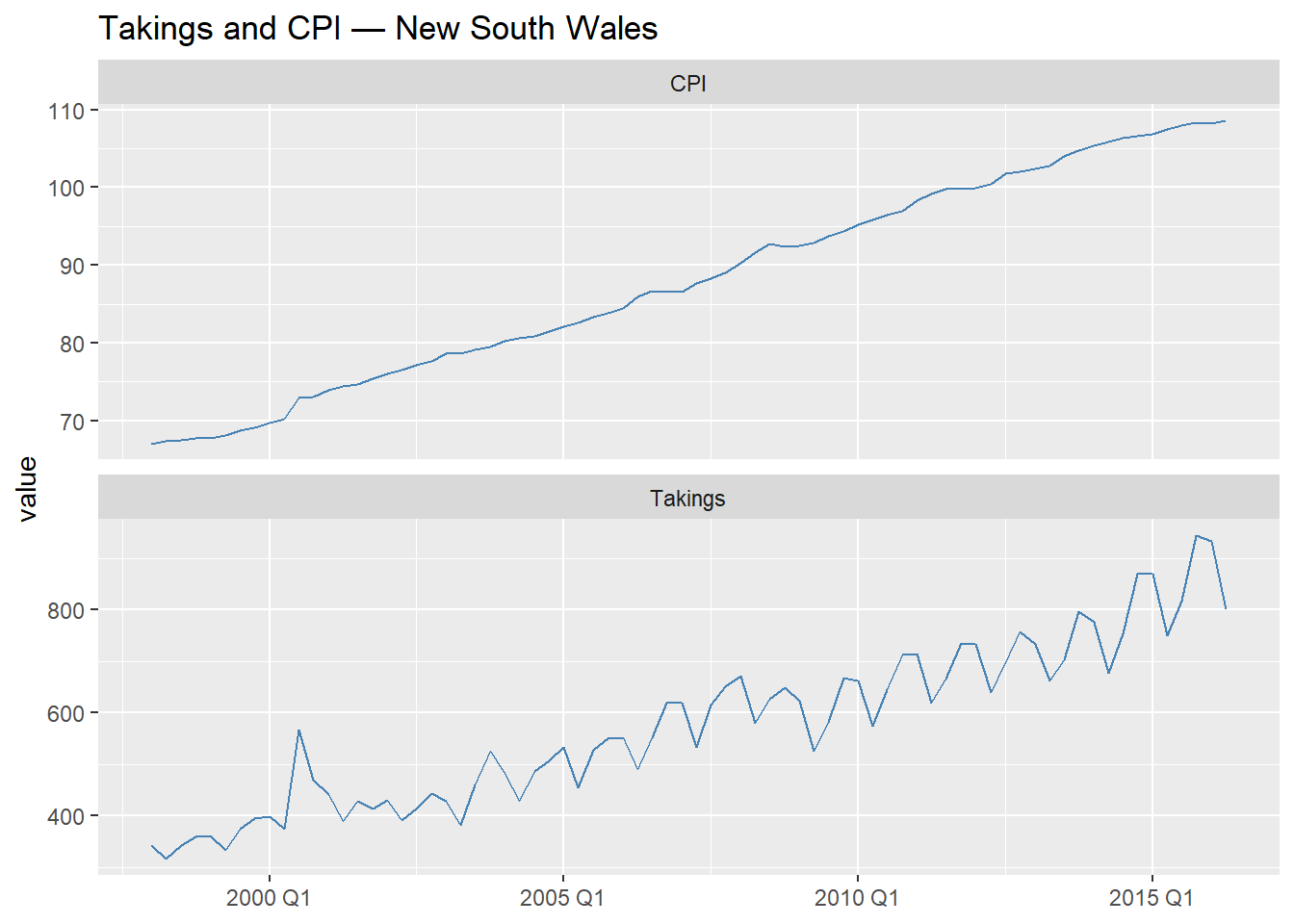
Both series trend upward over the sample period. The relationship is likely associative rather than causal in the strict sense: CPI is a general price index, and accommodation takings are a nominal revenue measure — both rise with inflation and economic growth. This creates a meaningful predictive relationship (higher prices → higher nominal revenue) but does not imply that CPI causes tourism demand. We should be careful not to over-interpret the regression coefficient as a causal effect.
Before adding any exogenous information, establish the best model you built in Modules 1 and 2 as your reference point. This is the bar every subsequent model must clear.
b.1 Fit the following models on nsw_train:
baseline: STL decomposition with Drift + SNAIVE (your Module 1 benchmark)stl_ets: STL + ETS on the seasonally adjusted component (Module 2)stl_arima: STL + ARIMA on the seasonally adjusted component (Module 2)sarima: fully automatic seasonal ARIMA without explicit decomposition (Module 2)b.2 Forecast 6 quarters ahead and evaluate accuracy on nsw_test using RMSE and MAPE. Which model performs best? Record this as your baseline for Parts c–f.
1baseline_spec <- decomposition_model(
  STL(log(Takings) ~
        trend(window = NULL) +
        season(window = "periodic"),
      robust = TRUE),
  RW(season_adjust ~ drift()),
  SNAIVE(season_year)
)

stl_ets_spec <- decomposition_model(
  STL(log(Takings) ~
        trend(window = NULL) +
        season(window = "periodic"),
      robust = TRUE),
  ETS(season_adjust ~ season("N"))
)

stl_arima_spec <- decomposition_model(
  STL(log(Takings) ~
        trend(window = NULL) +
        season(window = "periodic"),
      robust = TRUE),
  ARIMA(season_adjust ~ PDQ(0, 0, 0))
)

nsw_fit_b <- nsw_train |>
  model(
    baseline   = baseline_spec,
    stl_ets    = stl_ets_spec,
    stl_arima  = stl_arima_spec,
    sarima     = ARIMA(log(Takings),
                       stepwise      = FALSE,
2                       approximation = FALSE)
  )

nsw_fc_b <- nsw_fit_b |> forecast(h = 6)

nsw_accu_b <- nsw_fc_b |>
  accuracy(nsw_test) |>
  select(.model, RMSE, MAE, MAPE) |>
  arrange(RMSE)

nsw_accu_bmodel() call readable and make it easy to reuse individual components in Parts c–g.
stepwise = FALSE, approximation = FALSE performs an exhaustive search — appropriate given the short quarterly series where computational cost is negligible.
The best Module 1–2 model (typically stl_arima or sarima on this data) becomes the reference. Record its RMSE — any model in Parts c–g that does not beat this is not adding value.
c.1 Fit a TSLM model on nsw_train with log(Takings) as the response and trend(), season(), and CPI as predictors. Report the model summary with report().
c.2 Interpret the CPI coefficient. What does a one-unit increase in CPI imply for Takings? Is the sign what you would expect?
c.3 Run a full residual diagnostic with gg_tsresiduals() and a Ljung-Box test. Is the white noise assumption satisfied? What does any remaining autocorrelation tell you about the adequacy of the TSLM model?
c.4 To forecast 6 quarters ahead, you need future values of CPI. Use the actual test-set CPI values (ex-post forecast) to isolate the regression model’s performance from predictor forecast error. Compare accuracy against your Part b baseline.
c.1 — Fit TSLM
nsw_fit_tslm <- nsw_train |>
  model(
1    tslm = TSLM(log(Takings) ~ trend() + season() + CPI)
  )

report(nsw_fit_tslm)trend() adds a deterministic linear trend; season() adds m - 1 = 3 quarterly dummies; CPI is the exogenous predictor. All are specified jointly in a single formula — TSLM() handles the dummy variable construction internally.
Series: Takings
Model: TSLM
Transformation: log(Takings)

Residuals:
      Min        1Q    Median        3Q       Max
-0.090034 -0.035747 -0.009168  0.022670  0.337455

Coefficients:
               Estimate Std. Error t value Pr(>|t|)
(Intercept)    5.959385   0.868596   6.861 3.74e-09 ***
trend()        0.012810   0.008209   1.560    0.124
season()year2 -0.134611   0.022873  -5.885 1.74e-07 ***
season()year3 -0.022533   0.022998  -0.980    0.331
season()year4  0.027449   0.022933   1.197    0.236
CPI           -0.001043   0.013348  -0.078    0.938
---
Signif. codes:  0 '***' 0.001 '**' 0.01 '*' 0.05 '.' 0.1 ' ' 1

Residual standard error: 0.06667 on 62 degrees of freedom
Multiple R-squared: 0.9381, Adjusted R-squared: 0.9331
F-statistic:   188 on 5 and 62 DF, p-value: < 2.22e-16
c.2 — Coefficient interpretation
The CPI coefficient is on the log scale. Because \log(\text{Takings}) is the response, a one-unit increase in CPI is associated with a multiplicative change of e^{\hat{\beta}_{\text{CPI}}} in takings — approximately a 100 \times \hat{\beta}_{\text{CPI}} percent change for small values. The sign should be positive: higher prices (CPI) are associated with higher nominal revenue, consistent with inflation pushing up both costs and revenues simultaneously.
c.3 — Residual diagnostics
nsw_fit_tslm |> gg_tsresiduals(lag_max = 16)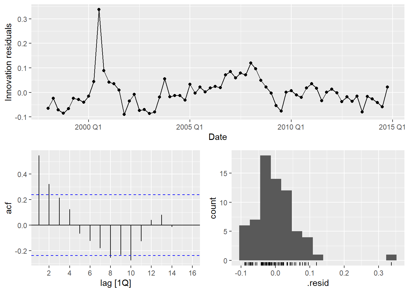
nsw_fit_tslm |>
  augment() |>
1 features(.innov, ljung_box, lag = 8, dof = 5)dof = 5: three seasonal dummies + trend + CPI = 5 estimated parameters (excluding intercept).
The ACF will almost certainly show significant autocorrelation at lags 1–2. The Ljung-Box p-value will be well below 0.05. This is the central pedagogical point of Part c: TSLM assumes \varepsilon_t \sim \text{WN}, but economic time series virtually never satisfy this. The correlated residuals invalidate standard errors, confidence intervals, and prediction intervals — motivating dynamic regression.
c.4 — Ex-post forecast
nsw_fc_tslm <- nsw_fit_tslm |>
1  forecast(new_data = nsw_test)

nsw_fc_tslm |>
  accuracy(nsw_test) |>
select(.model, RMSE, MAE, MAPE)nsw_test directly as new_data uses the actual CPI values from the test period — an ex-post forecast. This removes predictor uncertainty from the evaluation and measures the regression model in isolation.
Compare against Part b. TSLM may produce competitive point forecasts despite invalid residuals, but the prediction intervals should not be trusted.
The residual diagnostics in Part c revealed autocorrelation that TSLM cannot accommodate. Dynamic regression addresses this by allowing the error term to follow an ARIMA process.
d.1 Fit a dynamic regression model: ARIMA(log(Takings) ~ CPI). Let fable select the ARIMA order automatically. Report the selected model with report().
d.2 Run residual diagnostics. Have the residuals improved relative to Part c? Is the white noise assumption now satisfied?
d.3 Produce an ex-post forecast for the 6-quarter test period (using actual CPI values). Compare RMSE and MAPE against Part c and the Part b baseline. Does adding ARIMA errors improve accuracy?
d.4 What is the key structural difference between the TSLM in Part c and the dynamic regression model here? Write a brief explanation in your own words — no more than 4 sentences.
d.1 — Dynamic regression
nsw_fit_dyn <- nsw_train |>
  model(
1    dynamic = ARIMA(log(Takings) ~ CPI)
  )

report(nsw_fit_dyn)CPI (no pdq() or PDQ() constraints) lets fable choose the ARIMA order for the errors automatically. The seasonal structure of the error is determined by the data, not hard-coded.
Series: Takings
Model: LM w/ ARIMA(0,0,3)(1,1,2)[4] errors
Transformation: log(Takings)

Coefficients:
         ma1     ma2     ma3     sar1    sma1     sma2     CPI
      0.6292  0.4474  0.4015  -0.5327  0.2374  -0.6058  0.0213
s.e.  0.1324  0.1507  0.1776   0.1956  0.2318   0.1503  0.0032

sigma^2 estimated as 0.002891:  log likelihood=97.25
AIC=-178.51   AICc=-175.89   BIC=-161.24
d.2 — Residual diagnostics
nsw_fit_dyn |> gg_tsresiduals(lag_max = 16)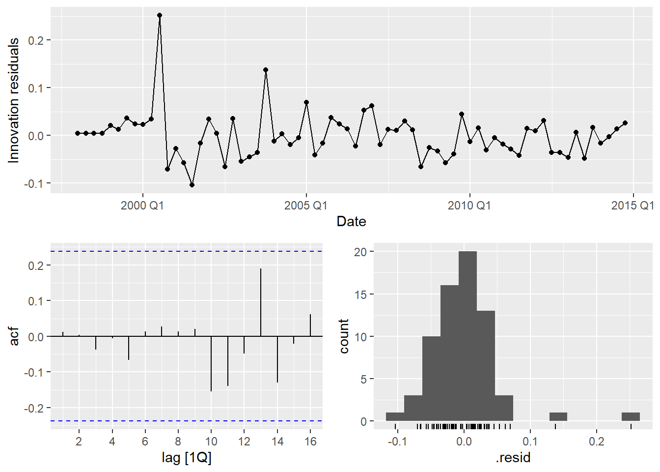
nsw_fit_dyn |>
  augment() |>
  features(.innov, ljung_box,
           lag = 8,
           dof = nsw_fit_dyn |>
                   coefficients() |>
                   filter(str_detect(term, "^ar|^ma|^sar|^sma|CPI")) |>
1 nrow())coefficients() ensures correctness regardless of which ARIMA order was selected.
The ACF of the innovations should now look like white noise. If any significant spike remains, it is likely at a seasonal lag and may be acceptable given the short series.
d.3 — Ex-post forecast and accuracy
nsw_fc_dyn <- nsw_fit_dyn |>
  forecast(new_data = nsw_test)

nsw_fc_dyn |>
  accuracy(nsw_test) |>
  select(.model, RMSE, MAE, MAPE)
d.4 — Structural difference
In TSLM, the error term \varepsilon_t is assumed to be white noise — independent across time. In dynamic regression, \varepsilon_t is allowed to follow an ARIMA(p, d, q)(P, D, Q) process, capturing the autocorrelation structure that remains after accounting for the deterministic components. The regression coefficients therefore measure the effect of CPI after controlling for the serial dependence in the series, and the prediction intervals properly reflect the uncertainty from both the regression and the ARIMA error. In short: TSLM models the mean function; dynamic regression models both the mean and the covariance structure.
e.1 Before fitting anything: with a quarterly series (m = 4), what is the maximum number of Fourier pairs K? Write out what the Fourier terms fourier(K = 1) and fourier(K = 2) produce for a quarterly series — how many columns does each generate?
e.2 Fit the following two models on nsw_train:
harmonic_k1: ARIMA(log(Takings) ~ fourier(K = 1) + CPI + PDQ(0, 0, 0))harmonic_k2: ARIMA(log(Takings) ~ fourier(K = 2) + CPI + PDQ(0, 0, 0))e.3 Now compare harmonic_k2 with the dynamic regression from Part d side by side: report the fitted equations (use report()), the number of estimated parameters, and the AICc values. What do you notice?
e.4 Forecast 6 quarters ahead with both harmonic models (ex-post) and add them to your accuracy table. Do the results surprise you? Explain why or why not, connecting your answer to what you worked out in e.1.
e.1 — Fourier terms for a quarterly series
For a quarterly series (m = 4), the maximum number of Fourier pairs is K_{\max} = \lfloor m/2 \rfloor = 2.
fourier(K = 1) generates 2 columns: \sin(2\pi t / 4) and \cos(2\pi t / 4).fourier(K = 2) generates 4 columns: the pair above plus \sin(4\pi t / 4) and \cos(4\pi t / 4).Here is the key insight: 4 Fourier columns for m = 4 span exactly the same space as 3 seasonal dummy variables (which is what season() produces in TSLM — m - 1 = 3 dummies). Both representations can fit any seasonal pattern with period 4. They are mathematically equivalent. This means harmonic_k2 should produce results identical to a model with season().
e.2 — Fit harmonic models
PDQ(0, 0, 0) suppresses the seasonal ARIMA component — seasonality is handled entirely by the Fourier terms. The non-seasonal AR/MA order is still selected automatically via pdq() (not constrained here).
K = 2 we include all possible Fourier pairs for m = 4. As derived in e.1, this fully represents any quarterly seasonal pattern.
e.3 — Compare harmonic_k2 with dynamic regression
report(nsw_fit_harm |> select(harmonic_k2))Series: Takings
Model: LM w/ ARIMA(1,0,0) errors
Transformation: log(Takings)
Coefficients:
ar1 fourier(K = 2)C1_4 fourier(K = 2)S1_4 fourier(K = 2)C2_4
0.5985 0.0143 -0.0804 0.0204
s.e. 0.0981 0.0077 0.0077 0.0040
CPI intercept
0.0202 4.5344
s.e. 0.0012 0.1085
sigma^2 estimated as 0.002984: log likelihood=104.12
AIC=-194.25 AICc=-192.38 BIC=-178.71report(nsw_fit_dyn)Series: Takings
Model: LM w/ ARIMA(0,0,3)(1,1,2)[4] errors
Transformation: log(Takings)
Coefficients:
ma1 ma2 ma3 sar1 sma1 sma2 CPI
0.6292 0.4474 0.4015 -0.5327 0.2374 -0.6058 0.0213
s.e. 0.1324 0.1507 0.1776 0.1956 0.2318 0.1503 0.0032
sigma^2 estimated as 0.002891: log likelihood=97.25
AIC=-178.51 AICc=-175.89 BIC=-161.24bind_rows(
glance(nsw_fit_harm) |> select(.model, AICc),
glance(nsw_fit_dyn) |> select(.model, AICc)
) |>
arrange(AICc)The AICc values and fitted ARIMA orders for harmonic_k2 and dynamic will be identical or near-identical, confirming the mathematical equivalence derived in e.1. The Fourier representation at K = K_{\max} adds no new flexibility over season() for quarterly data — it simply uses a different basis for the same subspace.
e.4 — Forecast accuracy
nsw_fc_harm <- nsw_fit_harm |>
  forecast(new_data = nsw_test)

nsw_fc_harm |>
  accuracy(nsw_test) |>
  select(.model, RMSE, MAE, MAPE)
The accuracy of harmonic_k2 is essentially the same as Part d’s dynamic regression — same model, different parameterisation. harmonic_k1 will be worse because K = 1 (2 Fourier terms) cannot represent all four quarterly patterns; it forces a sinusoidal shape on the seasonality, which is a restriction the data may not satisfy.
The pedagogical point: Fourier regression becomes genuinely valuable when m is large (daily or weekly data, where m = 365 or m = 52), because then we can use a small K to approximate a smooth seasonal pattern with far fewer parameters than m - 1 dummies. For quarterly data with m = 4, the method does not add anything at K = K_{\max} — and actually removes flexibility at K < K_{\max}.
f.1 Fit two Prophet models on nsw_train:
prophet_manual: specify a linear growth trend and multiplicative annual seasonality.prophet_auto: let Prophet decide all components automatically.f.2 Extract and plot the trend and seasonal components from prophet_manual using components(). Interpret the seasonal pattern: which quarter has the highest accommodation takings in NSW? Does this make sense given the context?
f.3 Forecast 6 quarters ahead with both Prophet models. Does Prophet require future CPI values to forecast? Why or why not?
f.4 Add both Prophet forecasts to your accuracy table. Compared to the regression-based models, what does Prophet gain and what does it sacrifice?
f.1 — Fit Prophet
Takings directly (not log-transformed) — Prophet models the level internally and handles non-constant variance via multiplicative seasonality. Passing a log would add an unnecessary layer of transformation.
f.2 — Components
nsw_fit_prophet |>
  select(prophet_manual) |>
  components() |>
  autoplot() +
  labs(title = "Prophet components — NSW accommodation takings")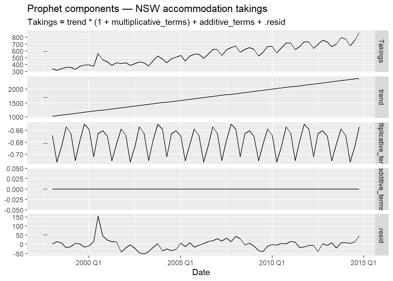
The seasonal pattern should show that Q1 (January–March) and Q4 (October–December) carry higher accommodation revenue — aligning with Australian summer holidays (December–February is peak summer) and the spring school holiday period. Q2 and Q3 correspond to autumn and winter, which are quieter for domestic tourism in NSW. This is contextually coherent.
f.3 — Forecast
nsw_fc_prophet <- nsw_fit_prophet |>
1 forecast(h = 6)h = 6 — no future CPI values are needed. Prophet is a univariate model: it uses only the history of Takings to extrapolate trend and seasonality. This is both a strength (no predictor forecasting required) and a limitation (it cannot incorporate CPI information in the forecast).
f.4 — Accuracy
nsw_fc_prophet |>
  accuracy(nsw_test) |>
  select(.model, RMSE, MAE, MAPE)
Prophet’s advantage is simplicity of deployment: no external predictors needed, interpretable components, automatic changepoint detection. Its limitation here is that it ignores the CPI information that the regression models incorporate — whether this matters depends on how informative CPI actually is for the 6-quarter horizon. On a short, well-behaved quarterly series, the regression models often win on accuracy; Prophet’s advantages emerge more clearly with longer, messier series at daily or sub-daily frequency.
g.1 Compile a single accuracy table with all models from Parts b through f. Rank by RMSE. Which model wins?
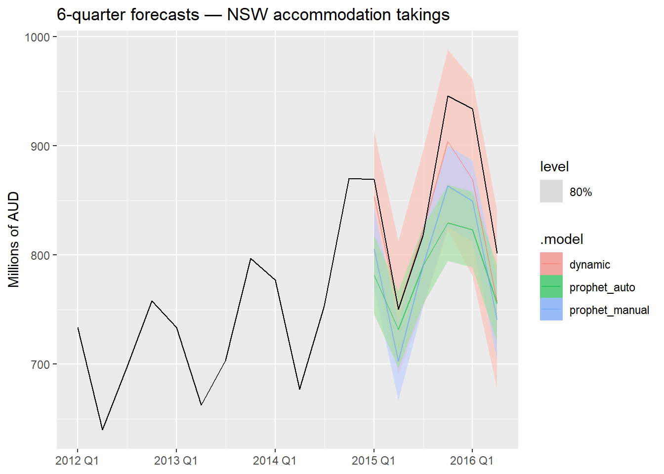
g.2 Examine the prediction intervals of the top two models by plotting their forecasts against the test set. Are the intervals well-calibrated (i.e., do the actual values fall within them)?
g.3 Answer the following questions:
harmonic_k2 genuinely a different model from the dynamic regression in Part d? Explain in one sentence.season() dummies? Give a concrete example.g.1 — Full accuracy table
nsw_accu_full <- bind_rows(
  nsw_fc_b       |> accuracy(nsw_test),
  nsw_fc_tslm    |> accuracy(nsw_test),
  nsw_fc_dyn     |> accuracy(nsw_test),
  nsw_fc_harm    |> accuracy(nsw_test),
  nsw_fc_prophet |> accuracy(nsw_test)
) |>
  select(.model, RMSE, MAE, MAPE) |>
  arrange(RMSE)

nsw_accu_full
g.2 — Forecast plot for top two models
# Identify top two models from the accuracy table and plot
1bind_rows(nsw_fc_dyn, nsw_fc_prophet) |>
  autoplot(nsw |> filter_index("2012 Q1" ~ .),
           level = 80, alpha = 0.6) +
  labs(
    title = "6-quarter forecasts — NSW accommodation takings",
    y     = "Millions of AUD", x = NULL
  )
g.3 — Discussion
a. CPI vs. univariate baseline: If dynamic regression outperforms sarima or stl_arima, CPI is adding predictive value beyond what the autocorrelation structure alone captures. The improvement is typically modest on short quarterly series but more pronounced if CPI contains leading information about tourism demand.
b. Dynamic regression vs. TSLM: Dynamic regression almost always improves prediction intervals (which are invalid under TSLM’s white noise assumption) and often improves point forecast accuracy as well, because the ARIMA error term absorbs residual autocorrelation that TSLM leaves unexplained. The improvement in Part c’s Ljung-Box test directly motivated this upgrade.
c. harmonic_k2 vs. dynamic regression: They are the same model expressed in different bases — Fourier pairs at K = K_{\max} = 2 for a quarterly series span exactly the same space as three seasonal dummies, so the fitted values, residuals, and forecasts are identical.
d. When Fourier is preferable: When m is large — for example, daily data with m = 365 or weekly data with m = 52. In those cases, fitting m - 1 seasonal dummies is infeasible (364 or 51 parameters just for seasonality), while a small K (e.g., K = 5 for daily data) captures the dominant seasonal shape with a fraction of the parameters, avoiding overfitting.
e. Production choice: On this dataset, the dynamic regression model (ARIMA(log(Takings) ~ CPI)) is the strongest candidate: it has valid residuals, uses the available exogenous information, and provides honest prediction intervals. The caveat is that it requires a CPI forecast for the horizon — if CPI forecasts are unreliable or unavailable, sarima or stl_arima from Part b may be more robust in practice. Prophet is a reasonable alternative if deployment simplicity is the priority and slight accuracy loss is acceptable.